Dealing with photography, either professionally or more amateurishly, everyone should be aware of some composition rules. But what is composition? It’s the element of every art, including photography, which makes the viewer able to grasp the vital message coming from a given piece of art so that they could feel emotions the author wanted to convey.
Now you can ask how it can be achieved if every snapshot can be different. There are, indeed, so many distinct types of photography, such as travel, wedding, portrait, landscape, wildlife, food, and many, many others. However, regardless of the kind of a photo, every professional photographer knows some general compositional rules and uses them in practice. Even if photography is only your hobby and a way of spending your free time, you can also find out something essential and introduce it to your own photography experience.
The Rule of Thirds
One of the fundamental composition rules used in photography is the rule of thirds. As an amateur, you may think that the main subject or object of your photo should always be placed at the centre. Not really. If you do that, your picture will be dead-boring and predictable. The rule of thirds is one of the most popular techniques, which divides your scene into nine equal rectangles, three across and three down. Today, many cameras have this function built in their manual modes. So, before taking the next photo, check it out, and use this composition rule. You’ll see that thanks to placing the crucial elements of your picture along with one or more of the lines or where the lines intersect, you’ll achieve a much more powerful effect.
Centred Composition and Symmetry
Nevertheless, it doesn’t mean that you can never put your main subject in the middle of the photo. According to another rule, some scenes work very well when they are symmetrical. And you can do that, both horizontally and vertically. What can you present like that? For example, a bridge or the landscape and its mirror reflection in the lake. Such scenes are perfect for a centred position, and they look great in square frames. So, be creative and play with the rule of thirds and centred composition so that your photo would make the best impression on others.
Frame Within the Frame
Has it ever happened to you to put the picture in an artificial frame? From now on, forget about it. Real photographers would instead look for some natural frames, like windows, arches or branches. And such a framework doesn’t have to surround the whole scene to look effective. It should always be only an addition to your picture. It can’t divert attention from the foreground objects or be too busy. Using a proper framework proves your creative ability to use surroundings to your compositions.
Except for framing, in some situations, you can use yet another composition technique, which concerns filling the whole frame so that the viewer could focus entirely on the main subject and its details without any additional distractions. This rule is usually applied in portraits when you want to showcase the face of a particular person.
Contrasting Colours
But what about colours? They are also crucial elements of every photo unless it’s black and white. To make your shot outstanding, it would be ideal if you selected contrasting colours. So, if one of your elements is vibrant, the rest of them should be muted. When you already used some warm accent, then look for something cool. And always contrast dark with light colours since our eyes have a tendency to move from darker towards lighter shades.
Also, it’s good to find some complementary colours, which placed next to each other create the strongest contrast. The best example is black and white or blue and yellow or orange, which are very often used to create many eye-catching advertisements.
Leading Lines
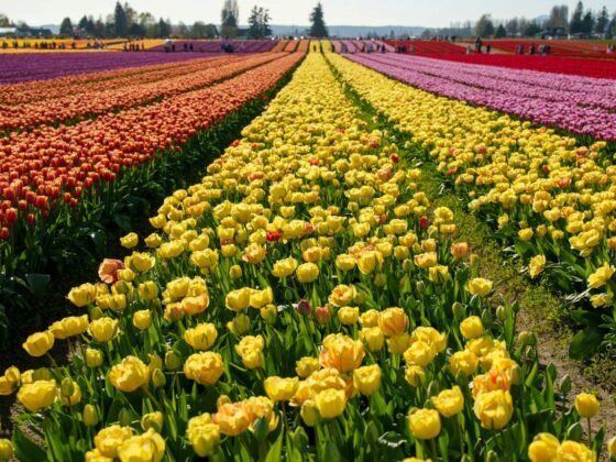
Taking a photo, you can also help the recipient find the way through the image to its vital element. How can you do that? Through leading lines, which can be either straight or curved. No matter which ones you choose, the effect should be the same. If the lines are correctly used, then the viewer’s eyes will move from one point to another. Such sequences can be exemplified by different things, like the patterns on the paving stones in front of the Eiffel Tower or a forest path. They can actually be compelling compositional features.
Keeping in mind all these compositional rules, you should know that they are not the only ones. But you can’t use all of them at once. It would be too overwhelming both for you and for the viewer. However, it’s always worth experimenting and mixing some of them to achieve the most pleasing effect.
Daria Skutecka


